Liberty Tower
Summary
We Redefined an Icon: Transforming a Neglected Landmark Into the Liberty Tower
Design
Category:
Rebrand
, Economic Development
Date:Feb 20, 2024
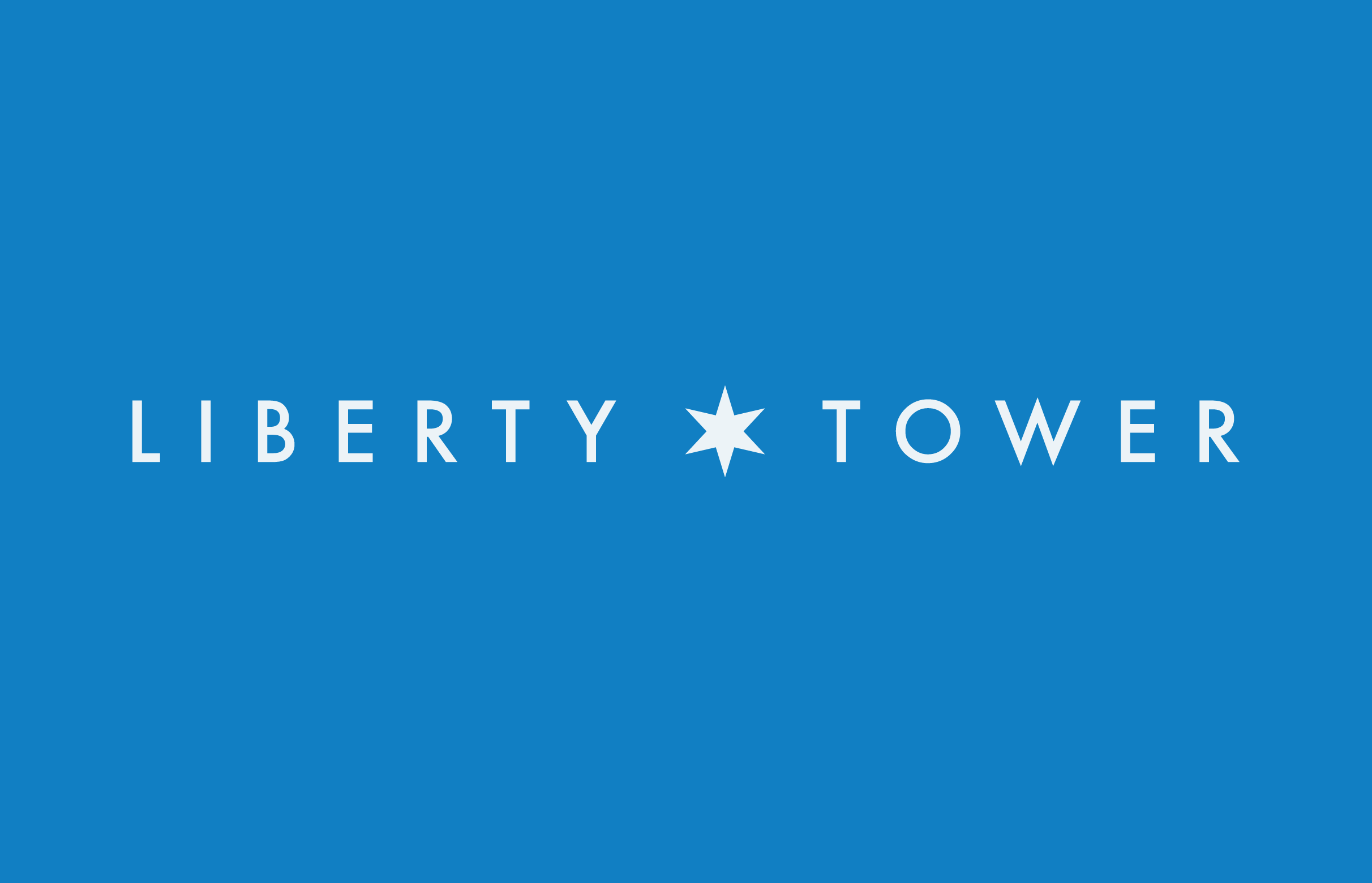
A rebranding project for Liberty Tower, formerly known as Chase Tower, coinciding with its reopening featuring a new hotel and bar, to embed a sense of community and pride within the heart of South Bend.
Client
Liberty Tower
Project Date
2017
Roles
Strategy, Branding, Graphic Design
Industry
Real Estate, Hospitality
Innovations
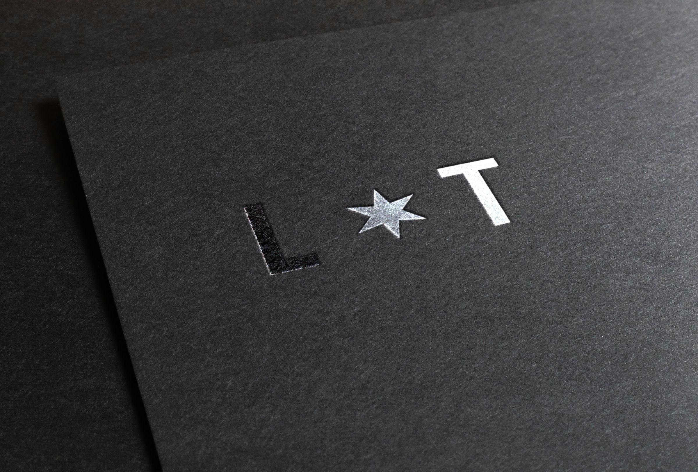
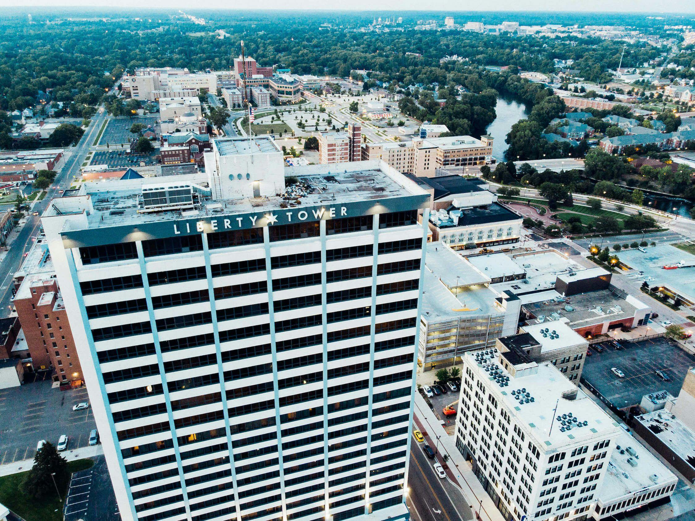
The centerpiece of this branding overhaul was the creation of a new logo and visual identity for what was formerly the dilapidated Chase building. The logo, a six-pointed star, symbolizes the unity of South Bend's six districts, reflecting the tower's connection to the community. This design choice not only pays homage to the local heritage by incorporating the emblem found on South Bend's flag but also seamlessly aligns with the Aloft Hotel brand through strategic use of color and typography. The logo's installation on the south face of the tower was a monumental effort, showcasing the collaborative spirit of the project.
Opportunity
With the reopening of the Chase building, featuring new hospitality amenities, there was a unique opportunity to redefine the building's image and name. The goal was to create a name and branding identity that resonated with the tower's historical significance to South Bend while ensuring it represented a modern, inclusive community landmark.
Solution
The project embarked on a deep dive into the essence of South Bend's identity. We worked with the owners from NY to strategize the name choice, and we selected Liberty Tower to reflect a sisterhood between the Freedom Tower in NY and the uniqueness of SB. This led to the conceptualization of a logo that embodied the spirit of unity and local pride. By adopting the six-pointed star from the city's flag and incorporating Aloft's branding elements, the new visual identity positioned Liberty Tower not just as a building, but as a symbol of community connection and pride. The successful installation of the logo, visible from afar, marked the tower as an iconic part of South Bend's skyline. The careful consideration of Aloft's co-branding ensured that the tower's new identity complemented its partnership with the hotel, achieving a harmonious blend of heritage and contemporary hospitality.
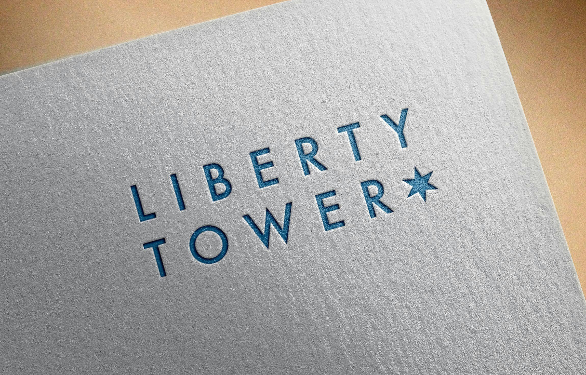
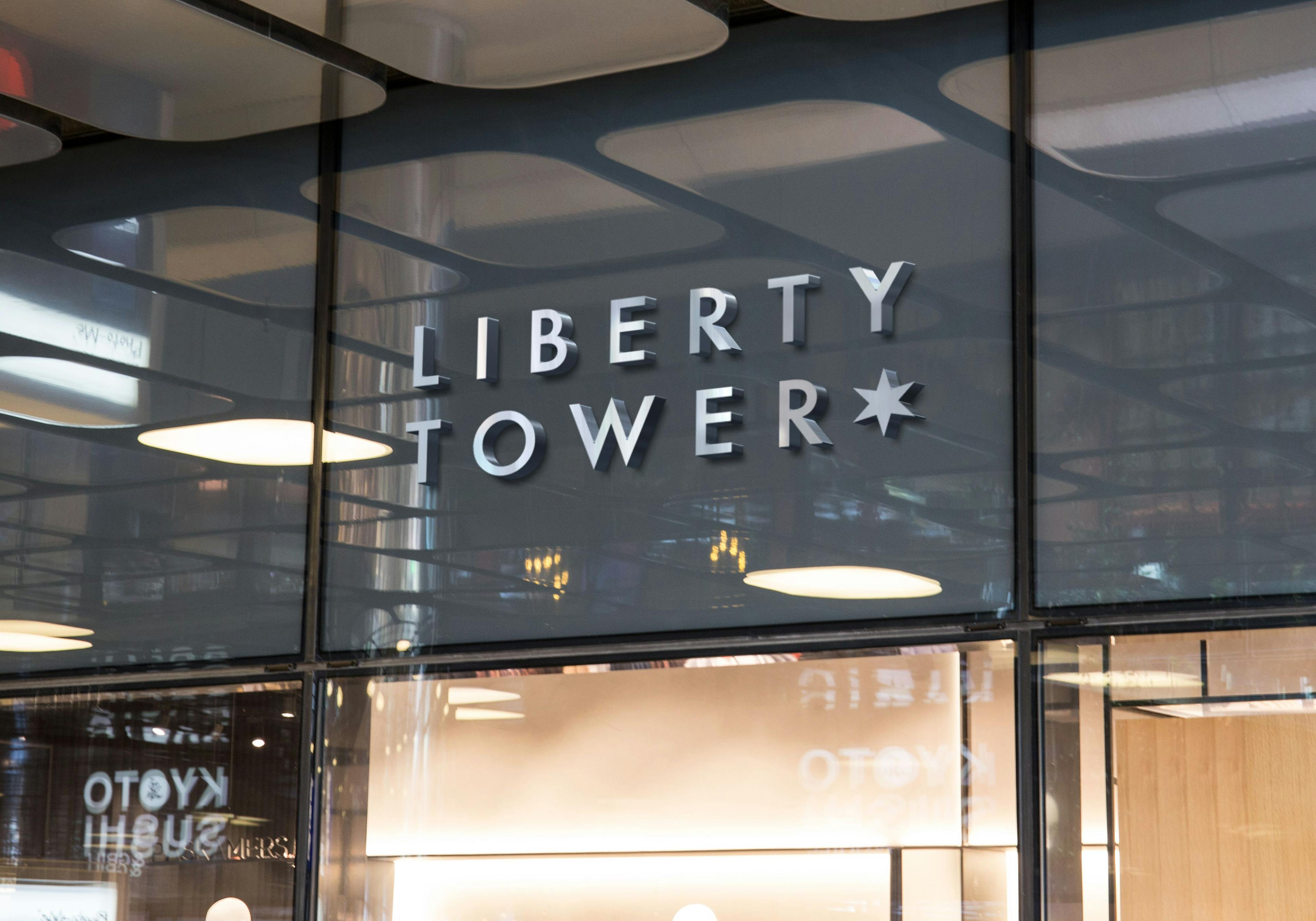
The rebranding of Liberty Tower as a landmark intertwined with South Bend's identity was more than a design project; it was a statement of unity and pride, successfully reflecting the tower's role in the community's fabric.

More

